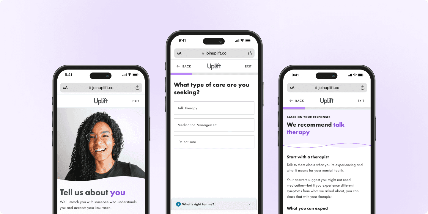

The problem
Figma dashboard was not scannable and gave little contextual clues
We used clear titles, but they were visually deprioritized in the Figma dashboard, making them easy to miss.
As our project count ramped up, the cognitive load to find the right file became a real problem. Other teammates often asked me for help locating specific parts of a project. The lack of intentional organization created unnecessary friction and slowed down collaboration.

Imagine a bunch of these laid out all across your screen 😵💫
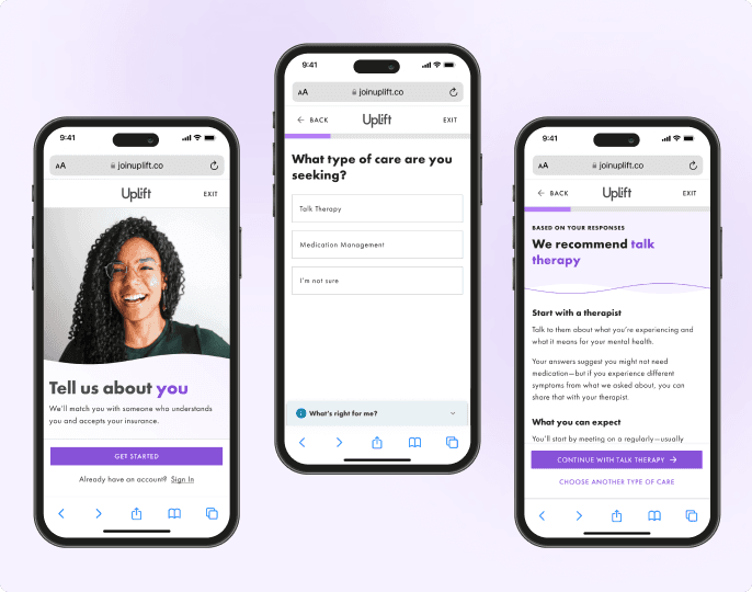
The SOlve
A new replicable and scalable system with maximum contextual clues
I proposed and implemented a new system for organizing files where a dedicated “about this file” page was created inside each project with purpose-built thumbnails and supporting structure.
Each page included:

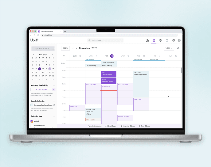
The Impact
An immediate difference and quick win
The Figma home became cleaner, more intentional, and far easier to scan. Teammates stopped asking me where to find things—a quiet but meaningful win.
As our team continued to grow, the improved organization made onboarding smoother and more intuitive. New designers were able to navigate and contribute faster, and the system was adopted with minimal guidance.